Six Study Tiles, One NASDAQ Day: The Theory, the Screen, and What the Data Supports

Every study tile in VisualHFT is a number on a screen. Behind each number sits a piece of published market-microstructure research, and each one makes a claim about what the order book or the tape is doing right now.
We wanted to see those claims happen on real exchange data, and then measure how far the data backs them. This article is the result. It covers six tiles, seven captures, one full trading day, and the research lineage of every metric.
The data. One NASDAQ TotalView-ITCH trading day, 22 August 2023, replayed through VisualHFT’s study plugins. Fourteen symbols, from QQQ at 5.63 million shares on the day to CTAS at 43,794. The order book is captured at 10 price levels per side.
The method, in three steps.
- Theory first. For each tile we wrote down what the research says should happen, as a rule, before looking at any outcome.
- Capture it. We replayed the recorded feed through the real application, near real time, and captured one real moment where the tile does what its theory describes. Each capture pauses at the key frames. The walkthrough below tells you exactly what to look at in each pause, with the numbers on screen.
- Count it and test it. We counted how often that behaviour happens across the day against matched moments where it should not. Then we tested each tile against the cheapest rule that could do the same job without it, on symbols held out from every design choice.
The short version. Every tile does what its theory describes, and every capture below is a real, recorded instance of that. As a predictive microstructure signal, the data showed clear statistical power: LOB Imbalance with the new Touch Weighted setting called the next mid-price tick 73.9% of the time against a 51.7% base rate on held-out liquid symbols (AAPL, AMZN, CSCO, GILD, NFLX). However, as a standalone taker trading strategy crossing the spread, single-tick moves are narrower than the spread itself. That is why quantitative desks use these predictive signals for passive order routing, queue priority, and adverse selection defense rather than naive market-order trading. Every capture here is a mechanism: a real, observable market phenomenon in action.
Each numbered section below stands alone. Read the one for the tile you use, or read them in order.
Predictive signals vs. standalone taker execution
This distinction runs through the whole article, so it comes first.
A predictive microstructure signal proves that an indicator extracts genuine, out-of-sample statistical structure from the limit order book—anticipating queue depletion, replenishment asymmetry, or the immediate next mid-tick repricing significantly above unconditional base rates.
A standalone taker trade is a much different bar. To execute profitably as an autonomous market order, the price move it calls has to exceed the cost of crossing the spread and exchange fees on its own.
A predictive signal is foundational for execution algorithms and market makers even when it is not a standalone taker trade, in two key ways:
- Passive queue placement and adverse selection: In institutional execution, knowing the next mid-tick move with 73.9% accuracy enables algorithms to earn the spread on passive limit orders and pull quotes before toxic flow hits, rather than paying the spread.
- Move size vs. spread cost: A statistically proven call on a half-cent mid move is high-value telemetry for an optimal execution engine, even though crossing a five-cent spread to chase it with a market order would lose money.
Every capture below is labelled as a mechanism. The hit rates live in the “what the day says” parts and in the scorecard, never beside a capture as if one clip proved them.
Takeaway: A clean clip shows that a tile works as designed. Quantitative execution desks leverage predictive book telemetry for passive routing and adverse selection defense, rather than naive standalone taker trades.
How we tested
- The split was fixed before any result existed. Discovery symbols: QQQ, AMD, INTC, MSFT, SBUX, VRTX, POOL. Hold-out symbols: AAPL, AMZN, CSCO, GILD, NFLX, IDXX, CTAS. Each test’s rules were locked before its hold-out was scored. The same hold-out symbols were re-scored across several rounds of this research, and the rules for choosing capture moments were written after those results. The hold-out is other symbols on the same day, not a later period.
- Each value is read from the moment it could be seen. A tile that aggregates over 100 milliseconds or 1 second keeps the time stamp of the moment its bucket opened, while its value keeps updating until the bucket closes. So a value stamped at 10:00:00.000 can already contain events from 10:00:00.090. Every test reads a value only from the first book update after it was computed. We call this the causal read. It changed some results, and we report the causal numbers throughout.
- Aggregation levels are the ones each tile ships with: LOB Imbalance and OTR at 100 ms, Market Resilience at 500 ms, TTO, VPIN and Market Resilience Bias at 1 second.
- Per-symbol settings come from a rule, not a search. The VPIN bucket size and the resilience shock window were derived from each symbol’s own statistics before any outcome was looked at. Both are settings you choose in each tile. The practitioner notes below explain how.
- The book is 10 levels per side. Anything read off the book depends on how many levels your feed delivers.
- The null is a free rival. A tile earns its place only if it beats the cheapest rule that does the same job without it. Beating a coin flip is not enough.
- The counts come from the same study code. The frequency and forecast numbers come from running the same study plugins over every event of the day, in order, in a test harness. The captures come from the application itself.
- A development build. All captures and counts use a development build that includes changes arriving in an upcoming release. Released builds label the two ratio tiles “OTR” and “TTO”; the captures show them as “OTR (count)” and “TTO (legacy)”.
Takeaway: decide the rules first, read each value only when it could have been seen, and compare against the cheapest alternative, not against chance.
How to read the captures
Every capture shows the same desk layout. On the left, the order book ladder: bids and offers, price and size, 10 levels per side, with the study tiles below it. In the middle, from top to bottom: the depth chart, the order book chart (every price level over time, with the best bid and offer), and the study’s own chart, where the green line is the study’s value and, on most captures, the white line is the mid price. On the right, Time and Sales: every print, green when the feed marks it as a buy, red when it marks it as a sell.
Each capture plays near real time. At the key frames it pauses, draws a box around what matters, and shows a caption. Some passages repeat at half speed. Long quiet stretches are fast-forwarded, and the capture says so on screen. The end card states the symbol, the date, the tile’s aggregation level and every speed change.
All times are US Eastern. All captures are from 22 August 2023.
1. LOB Imbalance: the book leans, holds, and the price follows
The theory
When one side of the book holds far more size than the other at the best prices, the next move of the mid price tends to go toward the thin side. Gould and Bonart (2016) showed this with the queue imbalance at the best bid and offer across 10 liquid NASDAQ stocks: the imbalance carried a strongly significant relationship with the direction of the next mid-price move.
Cont, Kukanov and Stoikov (2014) came at the same idea from the flow side. Over short intervals, price changes are driven mainly by order flow imbalance at the best quotes, with an impact that is inversely proportional to depth. A thin side moves the price more easily.
The practical reading: a heavy bid and a thin offer mean the offer queue is the one likely to empty first, and when it empties, the mid moves up.
How VisualHFT computes it
On every book update the tile sums resting size on each side across the captured levels and takes the normalised difference:
Imbalance = (bid size - ask size) / (bid size + ask size)The result runs from -1 (all size on the offer side) to +1 (all size on the bid side). The tile shows the latest reading to one decimal; the chart plots the last value in each aggregation bucket, 100 ms by default.
The Weighting setting, coming in an upcoming release, decides how the levels count:
- Equal Weight: every captured level counts the same. This is the classic whole-book ratio and the tile’s current behaviour.
- Touch Weighted (new): a level’s size is multiplied by 1 / (1 + d)², where d is the level’s distance from its own side’s best price, measured in spreads. A level one typical spread away counts a quarter. Two spreads away counts a ninth. The spread unit is the instrument’s running median spread, after the first 200 book updates, so the weighting adapts to each symbol’s price scale.
Touch Weighted is a new weighting setting coming in an upcoming release. The captures and numbers in this section use a development build that includes it.
Why the weighting matters: a whole-book sum lets size far from the touch dominate. Gould and Bonart’s result is about the best queues. Touch weighting keeps the whole captured book in the number while letting the levels near the best price carry most of the weight.
Watch it happen
IDXX, 12:58:09 to 12:59:07 ET. LOB Imbalance, Touch Weighted, 100 ms. Replayed near real time; 47 seconds fast-forwarded at five times speed; one passage repeated at half speed. Watch the book lean, hold, and the price follow.
Pause 1, 12:58:14.5. Look at the tile first: it reads -0.7. Negative means the book leans to the sell side.
Now look at the top of the ladder. At the best prices there are 5 shares bid at 487.35 and 367 shares offered at 487.76. The touch is lopsided. The tile does not read -1.0 because Touch Weighted still counts the deeper levels, at reduced weight.
Look at the chart: the white mid-price line is flat. Look at Time and Sales: the last trade printed at 12:58:08. The book leans, and nothing is happening to the price.
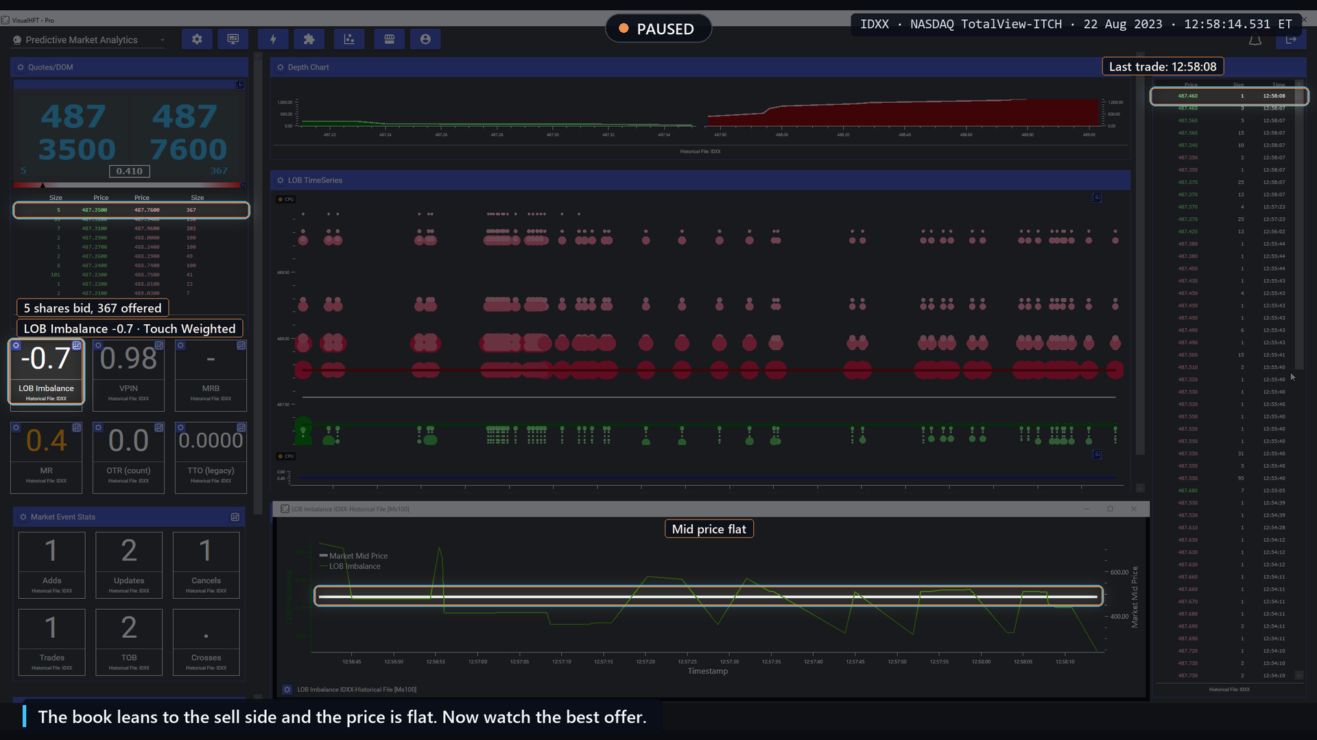
Pause 1, 12:58:14.5: the touch is 5 shares against 367, the tile reads -0.7, the mid is flat.
Fast-forward, 47 seconds. The best bid and offer do not change the whole time. Around 12:59:00 the tile deepens from -0.7 to -0.9.
Pause 2, 12:59:05.7. A new offer, 101 shares at 487.59, has become the best offer, 17 cents below 487.76. Nothing traded: Time and Sales still shows 12:58:08 as the last print, and the offer at 487.76 is still there, now 375 shares.
The mid price dropped 8.5 cents, from 487.555 to 487.470. The chart’s price axis zoomed in to show it. The order book chart shows the same step: the best offer and the mid move down together. The tile reads -0.9.
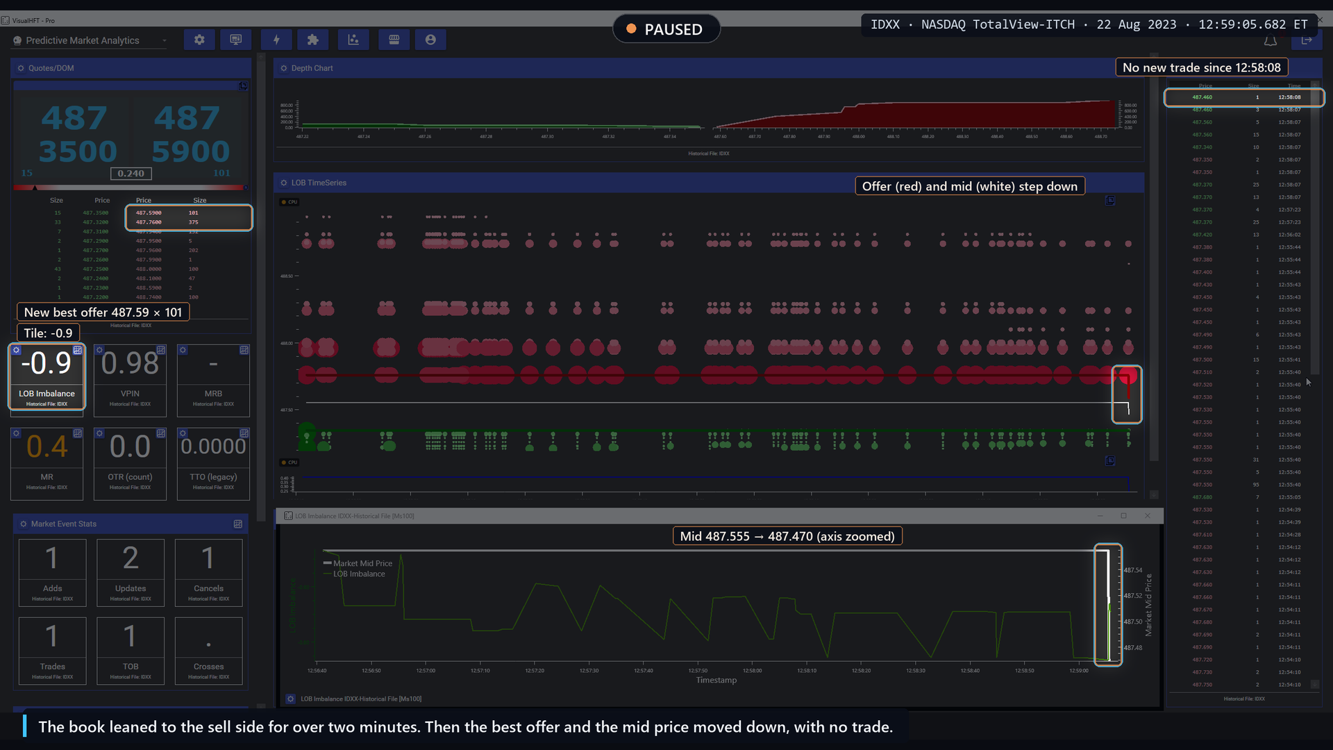
Pause 2, 12:59:05.7: a new best offer at 487.59, the mid steps down 8.5 cents, no trade.
Note how the price moved. The thin bid was not hit. A seller chose to improve the offer. The mid moved the way the book leaned, through a new quote, not a trade. The capture then replays that moment at half speed.
One more number from the same frames: the spread was 41 cents (487.35 to 487.76), almost five times the 8.5-cent move.
What the day says
How often the capture’s picture happens. The rule, written down before we looked: the mid price is flat, and the tile holds at least 0.6 in one direction for 3 seconds or more. Then we check whether the next mid change goes the way the book leans.
- With Touch Weighted: 588 such setups across the day. In 307 of them (52%) the next mid change went the lean’s way, counting the 96 setups where the mid did not move within 30 seconds as misses. The base rate for the same call after any flat spell of 3 seconds or more was 48.0% (p = 0.043). Among the 492 setups where the mid did move, 62.4% moved the lean’s way.
- With Equal Weight, the same rule found no difference: 251 of 518 setups (48.5%) against a 47.7% base, p = 0.73.
- The setup appears almost only on thinner and mid-liquidity names. QQQ and AMD produced none.
- On IDXX itself, the symbol in the capture, 39 of its 89 setups went the lean’s way, below its own base rate. The capture is one real instance, not a typical one for that symbol.
As a forecast, on the held-out liquid symbols. Every change in the tile’s value is a candidate. We keep the fifth of readings furthest from zero for each symbol and ask whether the sign calls the next mid tick.
| Test (held-out liquid symbols, top fifth of readings) | Equal Weight | Touch Weighted |
|---|---|---|
| Sign against the next mid tick | 58.2% vs 52.8% base | 73.9% vs 51.7% base |
| Touch Weighted over Equal Weight, same ticks | +15.8 points | |
| Tile against “the next tick undoes the last one” | Rule wins by 4.2 points | Tile ahead by 5.9 points |
| Tile against the best free rule, “undo the last tick, when it bounced” | Rule wins | +0.6 on hold-out (within noise); rule wins by 4.8 on discovery |
| Tile as a filter on the free rule, beyond a book-free bounce filter | +4.8 points hold-out, +3.0 discovery |
The weighting is the real finding here. On the same ticks, Touch Weighted beats Equal Weight by 15.8 points on the hold-out and 11.2 on discovery. As a confirming filter on the free rule, it adds information that no book-free filter in our test matched.
Three qualifications travel with those numbers:
- It ties or loses to a free rule as a standalone call. “Undo the last tick when it bounced” needs no order book and scores the same on the hold-out, better on discovery.
- The moves are smaller than the spread. On the held-out names the spread is 2.3 to 9.5 times the size of a correctly called move. No costs were applied.
- It is one trading day. The hold-out is other symbols on the same day.
How a practitioner uses it
- Read the lean together with the touch. The tile summarises the book. The ladder shows you which queue is thin. When the tile leans hard and the touch queue on the thin side is a few hundred shares or less, you are looking at the situation the research describes.
- Use it as context for a price-based rule, not as the rule. The one place the tile added something no free rule matched was as a filter on a simple reversal rule.
- Know your depth. Captured depth changes the number. In our depth tests, the share of readings above 0.5 fell as we captured more levels on 12 of 14 symbols. A 5-level feed and a 20-level feed show different tiles for the same market.
- Prefer Touch Weighted when it is available. It moves the tile toward the quantity the research actually tested.
Limits of the metric
The imbalance describes resting size. It cannot see hidden orders or orders about to arrive, and a single new quote can move the mid without any trade, as the capture shows. It says which way the book leans. It does not say how far the price will go.
Takeaway: a lopsided touch tends to resolve toward the thin side, and touch weighting captures that far better than an equal-weight sum. The move is small, and a free price-only rule does about as well.
2. VPIN: order flow turns one-sided
The theory
Easley, López de Prado and O’Hara (2012) defined order flow as toxic when it adversely selects the market makers who provide liquidity, often without them knowing it. Their measure, VPIN (volume-synchronised probability of informed trading), runs on a volume clock instead of a time clock. Trades are grouped into buckets of equal volume. When the buckets fill mostly from one side, the flow is one-sided, and the theory says liquidity providers widen their quotes or step back.
Running on volume time matters. In a busy minute many buckets close. In a quiet minute few do. The measure speeds up when the market does.
The measure has a published critique. Andersen and Bondarenko (2014) tested VPIN around the May 2010 flash crash and disputed its value as a predictor of short-term volatility. Our own one-day result, below, is also “no forecast”, so both readings are worth knowing.
How VisualHFT computes it
- In the default form, each trade is classified against the mid price at the time of the print: at or above the mid counts as a buy, below counts as a sell. (The original paper classifies volume in bulk from price changes. Both methods produce a buy and sell split per bucket.)
- Trades fill a bucket of fixed volume. A trade that overfills a bucket carries the remainder into the next one.
- When a bucket closes, its imbalance is |buy volume - sell volume| / bucket volume.
- VPIN is the average imbalance over the last n completed buckets, 50 by default.
The tile runs at 1 second and shows two decimals. 0 means every bucket in the window was balanced. 1 means every bucket was entirely one-sided.
Watch it happen
NFLX, 15:14:50 to 15:15:16 ET. VPIN at 1 second, bucket sized for NFLX (103 shares, 50 buckets). Replayed near real time; 14 seconds fast-forwarded at four times speed. Watch VPIN rise as the order flow turns one-sided.
Pause 1, 15:14:56. The VPIN tile reads 0.80. On the chart below it, the green VPIN line has been rising to 0.80, with a dip at 15:14:44, when a cluster of sells printed. The chart’s scale is zoomed so the steps are visible.
Now look at Time and Sales. 39 of the 48 prints on screen are green, marked as buys. The 9 red sells came at 15:14:43 and 15:14:44, the moment of the dip.
VPIN measures how one-sided the volume is. It does not say which side. The direction comes from the tape, not from the tile.
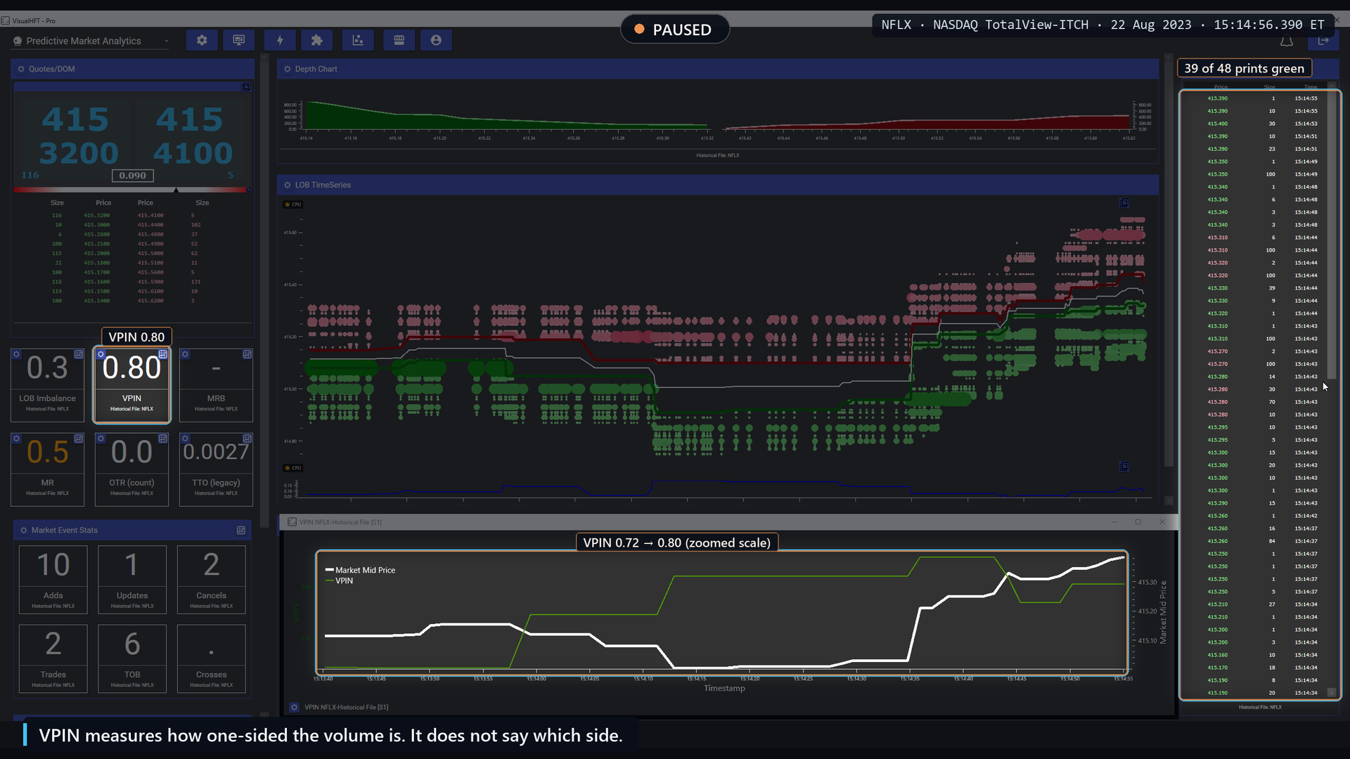
Pause 1, 15:14:56: VPIN 0.80, 39 of 48 prints marked as buys.
Fast-forward, 14 seconds. Watch the green line keep stepping up as buckets close.
Pause 2, 15:15:15.6. Nineteen seconds after the first pause, the tile reads 0.93. The green line has climbed to 0.93.
Time and Sales now shows 47 of 48 prints green, from 15:15:02 to 15:15:13. Four of them are half-penny prints from hidden orders, which the NASDAQ feed always flags as buys, so read the colour of those four with care. The quotes moved up: the best bid from 415.32 to 415.60, the offer from 415.41 to 415.71.
VPIN named no side. The tape is marked mostly buys, and the quotes moved up about 30 cents.
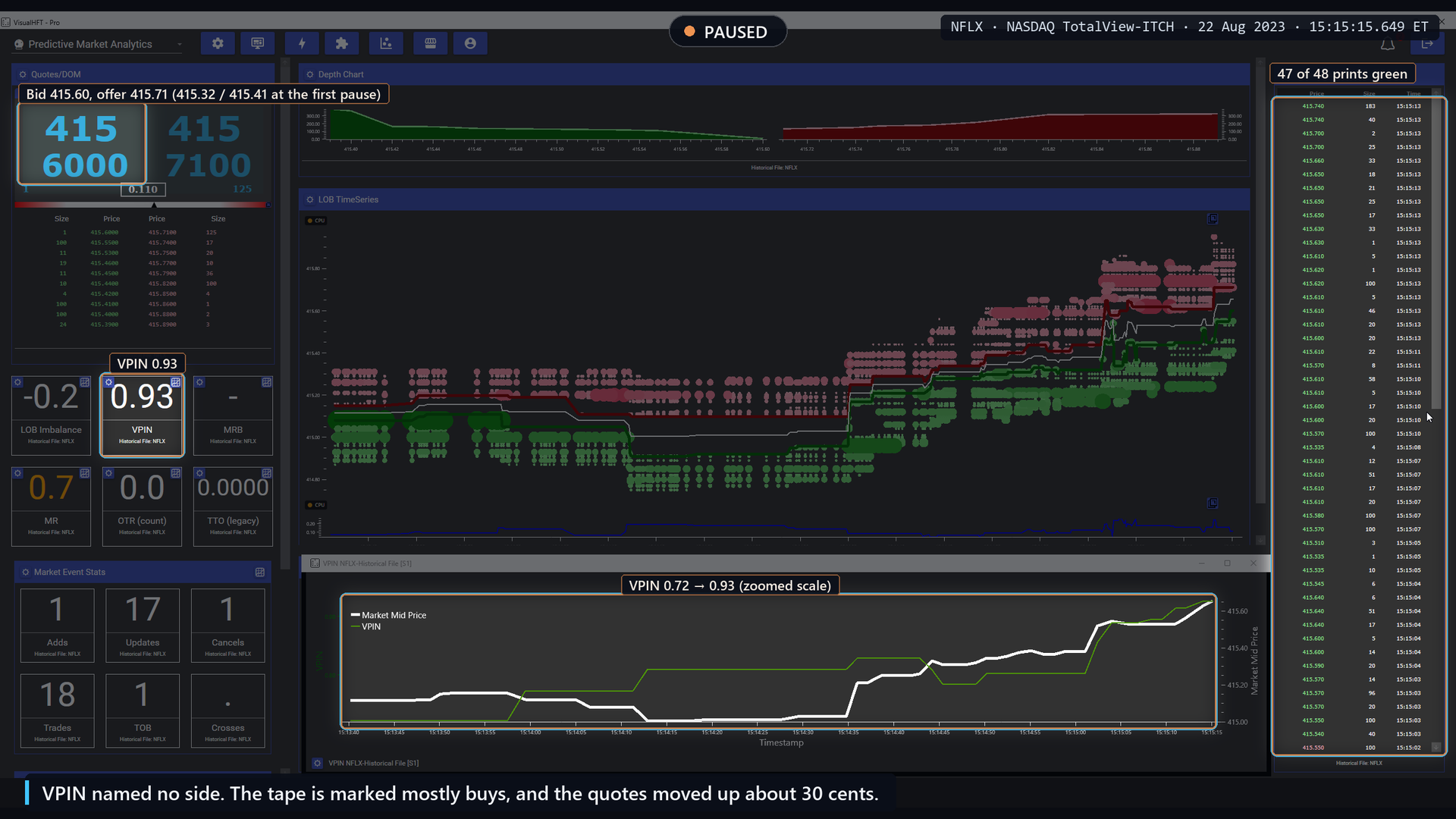
Pause 2, 15:15:15.6: VPIN 0.93, 47 of 48 prints marked as buys, quotes up about 30 cents.
What the day says
How often the capture’s picture happens. The rule: VPIN rises by at least 0.10 within 60 seconds to its own top-decile level for the day, while at least 60% of the traded volume in that stretch is one-sided. That setup appeared 35 times across the day. It is real and it is visible: VPIN does climb while the tape turns one-sided.
What the theory says comes next. The theory says spreads or short-term volatility should rise after such a climb. Over the following 60 seconds, volatility rose by half or more, or the spread widened by a fifth or more, after 16 of the 35 rises (45.7%). At matched moments with no such rise, the same happened 37.3% of the time. On one day that difference is not reliable (p = 0.30).
As a volatility forecast. We asked whether VPIN adds anything to a standard volatility forecast that already knows recent volatility and the time of day. On the held-out symbols, adding VPIN did not improve the forecast at 60 seconds, 5 minutes or 15 minutes.
VPIN’s designed use, ranking instruments by toxicity across many sessions, needs many days of data to test. One day cannot settle it.
How a practitioner uses it
- Size the bucket to the symbol. A bucket fixed in shares means very different things on different instruments: a few seconds of trading on one, hours on another. We set each symbol’s bucket to 1% of that day’s volume, split across 50 buckets: 723 shares for AMZN, 103 for NFLX. Set it in the tile’s settings. Symbols whose buckets would hold less than about one print each were left out of the VPIN tests.
- Read direction from the tape. VPIN is unsigned. Pair it with Time and Sales or a signed flow measure to know which side is pressing.
- Treat it as a toxicity gauge, not a timer. A high reading says the flow in the window was one-sided. It does not say what happens in the next minute.
Limits of the metric
VPIN depends on trade classification, bucket size and window length, and each choice changes the number. A rise can come from one large burst or from steady pressure; the capture shows the steady kind. The value moves in steps as buckets close, so on a quiet symbol it can sit still for long stretches.
Takeaway: VPIN shows when the flow turns one-sided, in volume time. On this day it did not tell us what the next minutes of volatility would be.
3. Market Resilience: the book takes a hit and refills
The theory
Kyle (1985) described liquidity in three dimensions: tightness (the cost of a round trip), depth (the order size needed to move the price) and resiliency (how fast prices recover from a shock). Resiliency is the one a single snapshot of the book cannot show. You have to watch the book after something hits it.
Obizhaeva and Wang (2013) showed why it matters for execution. The optimal way to work an order depends on the dynamics of supply and demand, especially resilience, the speed at which the book recovers to its steady state after a trade, rather than on the static spread and depth.
Large (2007) measured resiliency directly on a London Stock Exchange order book. After large trades, the book did not reliably replenish in over 60% of cases. When it did replenish, it did so quickly, with a half-life of around 20 seconds.
So the theory the tile illustrates is about depth coming back. It is not a claim that the price comes back.
How VisualHFT computes it
- A large trade anchors the event. A print more than two standard deviations above the mean of the last 500 trade sizes starts a shock.
- The tile watches the spread and the depth. Depth is measured as immediacy-weighted depth: each level’s size times 1 / (1 + d)², with d in spreads from the best price, the same weighting idea as Touch Weighted above. A side is depleted when this depth drops well below its own running median, by a robust z-score of 3 or more.
- Recovery has a window. A depleted side has recovered when it regains 90% of the depth it lost, with its best price back near where it was, inside the shock window.
- The score compares this recovery with the session’s own. When all four components are present, depth recovery carries 50% of the score, the size of the shock trade 30%, spread recovery 10% and the size of the spread widening 10%. A recovery exactly as fast as the average of the last 500 recoveries scores 0.5 on its component; faster scores higher; a side that never came back scores 0.
The tile runs at 500 ms and shows one decimal. A low score means a slower, weaker refill than this market’s own recent recoveries.
Watch it happen
AMZN, 15:30:39 to 15:31:05 ET. Market Resilience at 500 ms, shock window set for AMZN (2,414 ms). Replayed near real time; one passage repeated at half speed; 16 seconds fast-forwarded at twice speed. Watch the book take a hit, then refill.
Opening. Watch three things: the order book, the MR tile (reading 0.4) and Time and Sales.
Pause 1, 15:30:45.2. A burst of prints hits Time and Sales, most of them red: sells into the bid, with prints as low as 134.03.
Look at the bid side of the ladder. The best bid is 134.04. Less than a second ago it was 134.19. No bids are left between 134.19 and 134.05; the bid ladder now starts at 134.04. The bid side took a hit. The capture replays it at half speed.
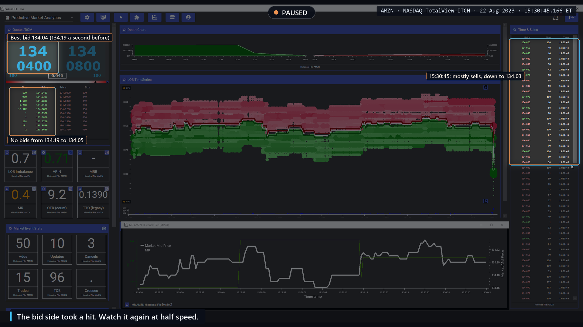
Pause 1, 15:30:45.2: the bid side takes a hit, from 134.19 to 134.04.
Pause 2, 15:30:48.7. The MR tile drops from 0.4 to 0.3: a low resilience score after this hit. On the chart, the green MR line steps down, and the white mid line sits near 134.05.
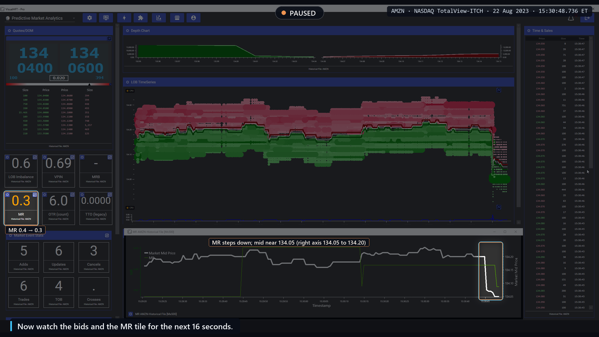
Pause 2, 15:30:48.7: the MR tile drops from 0.4 to 0.3.
Fast-forward, 16 seconds. Watch the bids and the MR tile.
Pause 3, 15:31:05. MR has climbed from 0.3 to 0.5. The bids have refilled: every price from 134.12 down to 134.03 now holds between 100 and 858 shares. The best bid is back at 134.12. It fell from 134.19 to 134.04, with prints as low as 134.03, so about half of the drop has come back.
On the chart, MR steps back up while the white mid line recovers part of the fall. The book took a hit, the bids refilled, and MR climbed back. The price came back about halfway.
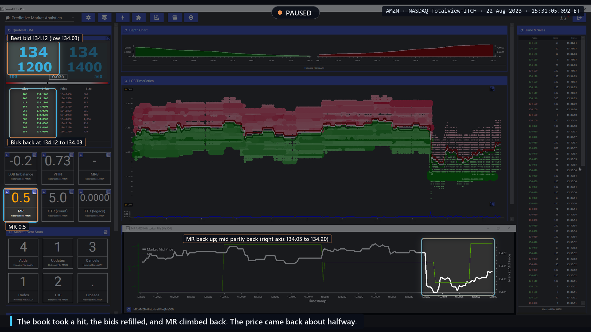
Pause 3, 15:31:05: the bids have refilled and MR is back at 0.5.
What the day says
How often the capture’s picture happens. The rule: a side’s depth falls to 60% or less of its median over the prior 2 seconds. Then the score dips by at least 0.1 within 6 seconds, the depth returns to 80% of its pre-shock level within 20 seconds, and the score climbs back within the same 20 seconds.
- 845 depletions across the day. 205 of them (24%) showed a dip in the score.
- 79 of them (9.3%, about 1 in 10) showed the full dip-and-recover cycle you just watched. At matched moments with no depletion, the same score pattern appeared 3.0% of the time.
- The AMZN capture is one of those 79 cycles.
- 76% of depletions showed no dip at all. Across 6,671 depletion moments on the liquid symbols, the score fell within 2 seconds 17.3% of the time and rose 16.3% of the time.
- Full cycles appeared only on QQQ, AAPL, AMZN and AMD, the most active names.
Price is a different question. Across the 74 full cycles we screened for price, 20 seconds after the depletion the median cycle had recovered 42% of its price drop. The theory is about depth, and depth is what the tile follows.
As a forecast of cost. We asked whether a low reading tells a liquidity provider that the next 5 seconds will cost more, in spread or in the price move after a passive fill. On the held-out symbols neither difference was significant (spread p = 0.30, post-fill price move p = 0.65). Adding the score to a forecast that already knows the current spread did not improve it.
How a practitioner uses it
- Set the shock window to the symbol. The window decides how long the tile waits for depth to come back. We set it to the 90th percentile of each symbol’s observed depth-recovery time: 1.0 second on QQQ, 2.4 seconds on AMZN, up to 5.2 seconds on VRTX. Set it in the tile’s settings.
- Read it next to the ladder. The score tells you how this recovery compares with the session’s. The ladder tells you which side was hit and whether size is coming back at the old prices.
- Use it for execution context. After a hit, a low score says this book is refilling more slowly than usual. That is the moment to be careful about how much size you show or take.
Limits of the metric
The score is relative to the same session’s recoveries, so it describes how unusual a recovery is, not its absolute cost. It needs large trades to anchor events, so quiet symbols produce few readings. Most depletions do not move the score.
Takeaway: Market Resilience turns Kyle’s third liquidity dimension into a number you can watch. It describes the recovery you just saw. It does not forecast the next one.
4. Market Resilience Bias: the side that fails to refill
The theory
Large (2007) measured how often and how fast a limit order book replenishes after large trades. If one side is hit and comes back while the other side is hit and does not, the side that stays thin is where liquidity providers are unwilling to stand. The Bias tile turns that asymmetry into an arrow. Mapping the failed side to a direction is VisualHFT’s own construction on top of the published resiliency measurement.
How VisualHFT computes it
The Bias tile runs the same resilience calculation as Section 3 and adds two rules.
- It only speaks when resilience is poor. The arrow can appear only after the resilience score falls to 0.30 or below. It clears back to a dash once the score recovers to 0.50 or above.
- Direction comes from the side that failed. When a depth event ends with the bid depleted and not refilled, the arrow points down (↓). When the offer failed, it points up (↑). When both sides came back, or both failed together, it shows a dash.
The tile runs at 1 second. It has its own shock window setting; we set it to the same per-symbol value as Market Resilience.
Watch it happen: the bid fails
AMZN, 13:14:02 to 13:15:23 ET. Market Resilience Bias at 1 second, shock window set for AMZN. Replayed near real time; 58 seconds fast-forwarded at eight times speed. Watch which side fails to refill after a large trade.
Pause 1, 13:14:10. At 13:14:06, a burst of prints hits Time and Sales: 28 of 31 are red, sells into the bid, from 134.24 down to 134.19.
The MRB tile has just switched to ↓: the tool reads the bid side as failing to refill. The best bid sits at 134.21. Before the sells it was 134.24.
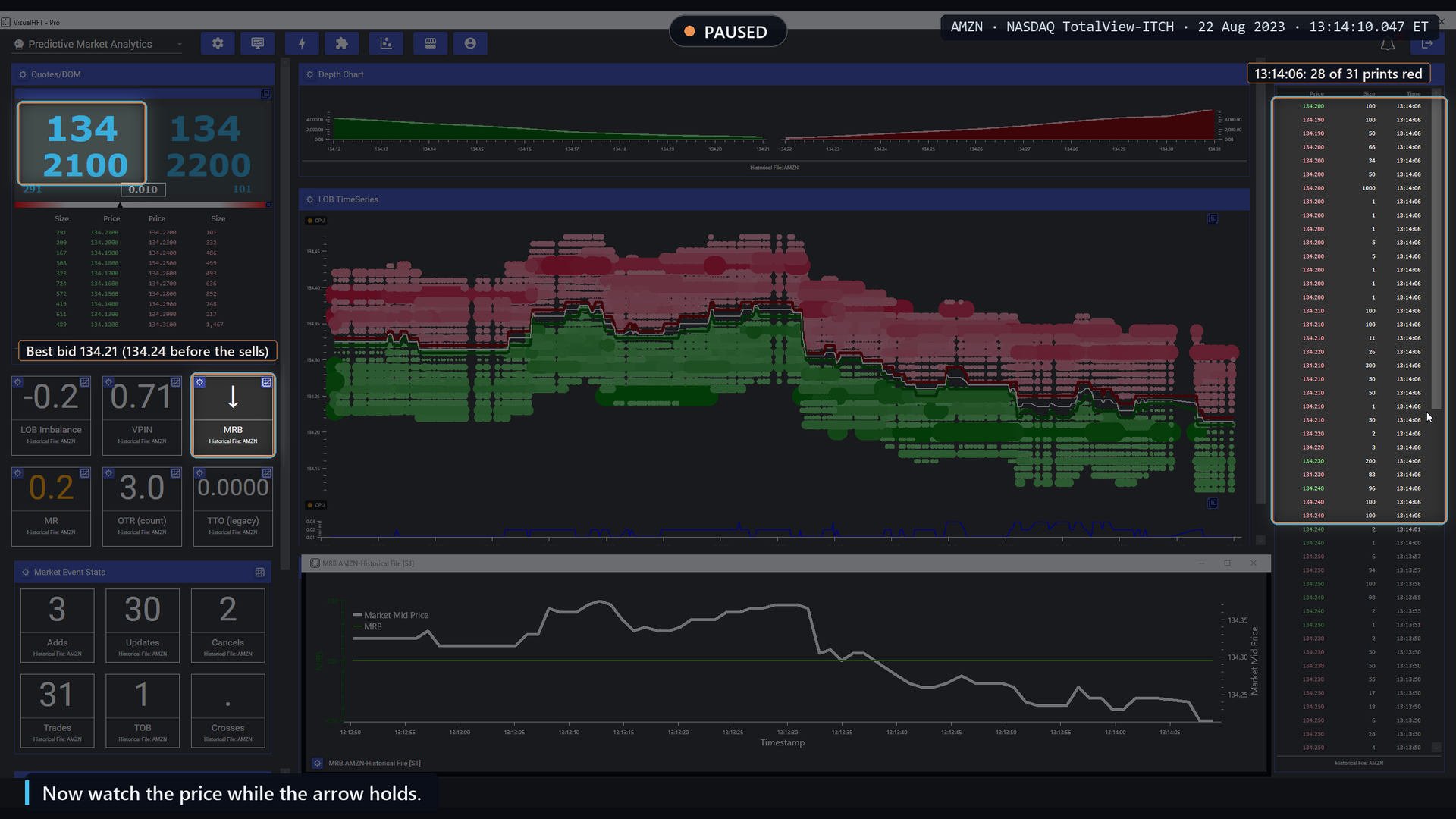
Pause 1, 13:14:10: the arrow switches to down after sells hit the bid.
Fast-forward, 58 seconds. The arrow stays ↓ the whole time.
Pause 2, 13:15:22. The arrow has held ↓ for 72 seconds. The best bid is 133.99, down from 134.21 when the arrow appeared.
On the chart, after the green MRB line dropped to -1, the white mid line slipped to about 134.17 within seconds, held there for about a minute, then fell to about 134.00. The arrow held throughout and the price ended lower. We picked this moment because the price followed.
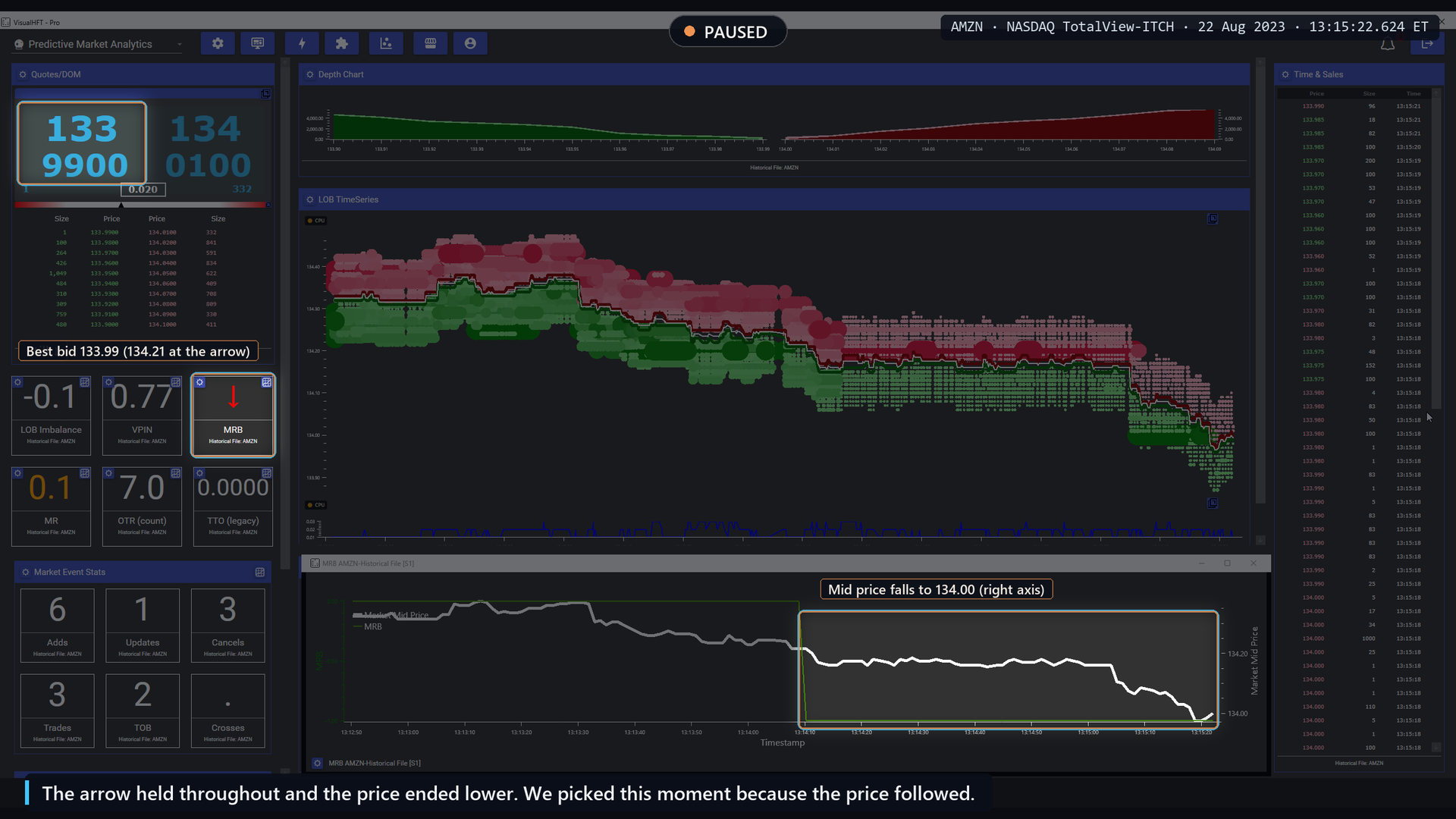
Pause 2, 13:15:22: the arrow has held for 72 seconds; the best bid is 133.99.
Watch it happen: the offer fails
AMZN, 14:25:18 to 14:27:48 ET. Market Resilience Bias at 1 second, shock window set for AMZN. Replayed near real time; 127 seconds fast-forwarded at eight times speed. Watch which side fails to refill after a hit to the book.
Pause 1, 14:25:28. At 14:25:23, six red prints at 133.89, 379 shares, sell into the bid.
The MRB tile has switched to ↑: the tool reads the ask side as the one that failed to refill, although these prints hit the bid. On the chart, the green MRB line steps up. The best bid is 133.86.
This is worth pausing on. The arrow does not come from the colour of the last prints. It comes from the tile’s own depth measurement across the book, and here that measurement judged the offers as the side that did not come back.
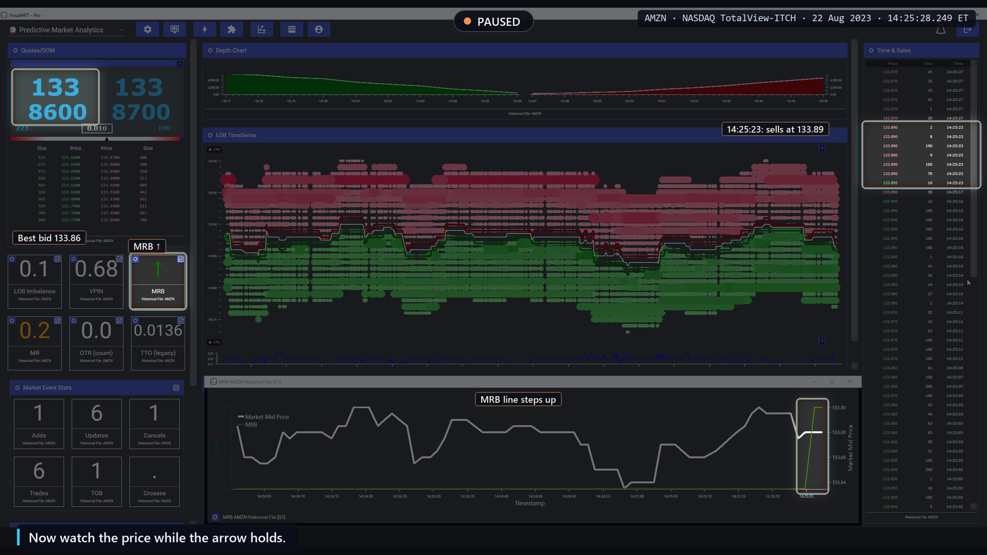
Pause 1, 14:25:28: the arrow switches to up, the best bid is 133.86.
Fast-forward, 127 seconds. The arrow stays ↑.
Pause 2, 14:27:47. The arrow has held ↑ for more than two minutes. The best bid is 134.10, up from 133.86 at the first pause.
On the chart, the white mid line dipped for about 20 seconds after the step, then climbed to about 134.10. The arrow held and the price rose. We picked this moment because the price followed.
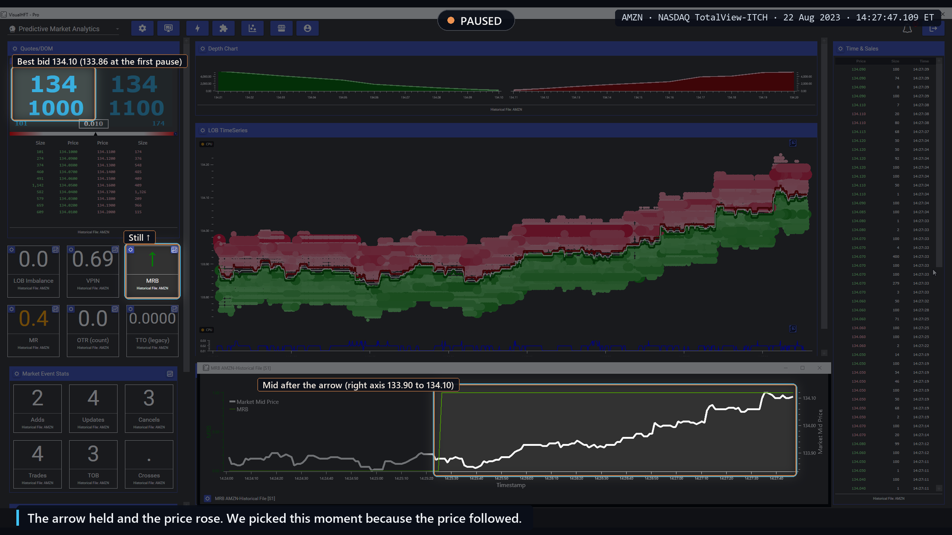
Pause 2, 14:27:47: the arrow has held for more than two minutes; the best bid is 134.10.
What the day says
How often the arrow appears. The tile fired 127 times across the day, 84 down and 43 up, and each arrow stayed on screen for a median of 30 seconds. It fired on 7 of the 14 symbols, mostly the most active names.
How often the capture’s picture happens. For the frequency rule we required the arrow to hold 5 seconds or more, and the failing side to show a fresh depletion in the prior 10 seconds, with its depth still at 80% or less of normal. 24 firings met that stricter test. In 14 of them (58%) the mid price 30 seconds later had moved the arrow’s way, against 46.8% by chance for the same call. On 24 events that difference is not reliable (p = 0.31).
The bid-fails capture meets that stricter test. The offer-fails capture does not, so we attach no frequency number to it. It is shown because it is a clear, real instance of the arrow holding on the other side.
As a direction forecast. On the held-out symbols, the arrow agreed with the next 5 seconds of price 52.1% of the time against a 48.9% base rate, and with the next 30 seconds 52.2% of the time, the same as a rule that simply reverses the last tick. Neither is a reliable difference (p = 0.64 and 0.63).
How a practitioner uses it
- Treat the arrow as a description of the last shock. It tells you which side of the book did not come back after being hit. That is useful context for where resting liquidity is thin right now.
- Check it against the ladder. When the arrow and the ladder agree that one side stayed thin, the picture is consistent. When they disagree, as in the second capture, look at the depth levels, not just the prints.
- Set its shock window to the Market Resilience value. The two tiles have separate settings but share the resilience calculation, so calibrate them together.
Limits of the metric
The arrow speaks rarely, only after poor recoveries, and it holds for tens of seconds, so it describes a state rather than a moment. On this day it did not call the next move better than chance. Both captures were chosen because the price followed; the counts above are the fair picture.
Takeaway: Market Resilience Bias points at the side of the book that failed to refill. It is a map of where liquidity is missing, not a direction call.
5. OTR: the book churns while nothing trades
The theory
Hasbrouck and Saar (2009) found that on an electronic limit order book a large share of limit orders are fleeting: submitted and cancelled within seconds, without trading. That blurred the traditional view of limit orders as patient liquidity. The order-to-trade ratio (OTR) measures that churn: how much the book changes per trade.
Regulators track the same quantity. Friederich and Payne (2015) studied the Italian Stock Exchange’s penalty on high order-to-trade ratios and found it was followed by a collapse in quoted depth and higher price impact, with spreads unchanged. In the EU, MiFID II requires trading venues to calculate the ratio of unexecuted orders to transactions for each member and each instrument (Commission Delegated Regulation (EU) 2017/566). That regulatory ratio is computed per member, which a public feed cannot identify. The tile measures the market-wide intensity of book changes against trades.
How VisualHFT computes it
In each aggregation window, 100 ms by default, the tile counts book changes at the tracked levels: additions, removals, and modifications, with a modification counted twice because it stands for a cancel and a replace. It divides by the number of trades in the window, with a floor of one, and subtracts one:
OTR (count) = book changes / max(trades, 1) - 1The count resets every window. The tile shows one decimal. A reading of 62 in a window with no trade means 63 book changes in that 100 ms.
Watch it happen
IDXX, 13:14:55 to 13:15:07 ET. OTR (count) at 100 ms. Replayed near real time; one passage repeated at half speed. Watch the book churn with no trades.
Opening, 13:14:55. The OTR (count) tile reads 0.0. The best bid is 486.42 and the best offer 486.71.
Pause 1, 13:15:03.4. The tile has read 62 since 13:15:00.6: dozens of book changes and no trade in one 100-millisecond window.
In that burst, the best offer stepped down 5 cents, from 486.71 to 486.66. The best bid stayed at 486.42. The spread narrowed from 0.29 to 0.24. Time and Sales shows no trade since 13:14:30. The OTR chart draws the burst as its tallest spike of the stretch.
The book changed dozens of times while nothing traded. The replay continues.
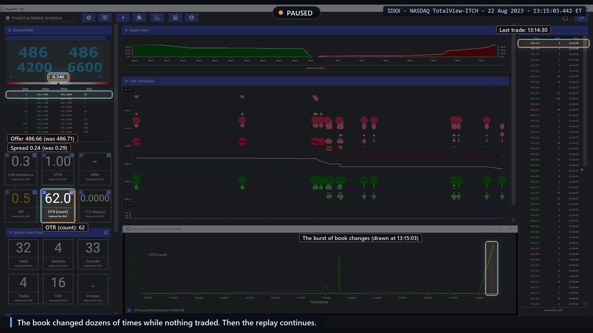
Pause 1, 13:15:03.4: OTR (count) reads 62 with no trade since 13:14:30.
Pause 2, 13:15:07.3. The best bid has fallen from 486.42 to 485.98. The best offer moved from 486.66 to 486.45. The spread widened from 0.24 to 0.47.
Time and Sales shows a run of trades stamped 13:15:05 to 13:15:06, from 486.42 down to 486.11, most marked as sells. On the order book chart, the mid price fell 32.5 cents, from 486.54 to 486.215. The OTR chart still shows the burst as its tallest spike.
About five seconds after the tile jumped to 62, the quotes moved fast and the spread nearly doubled. The capture replays the move at half speed.
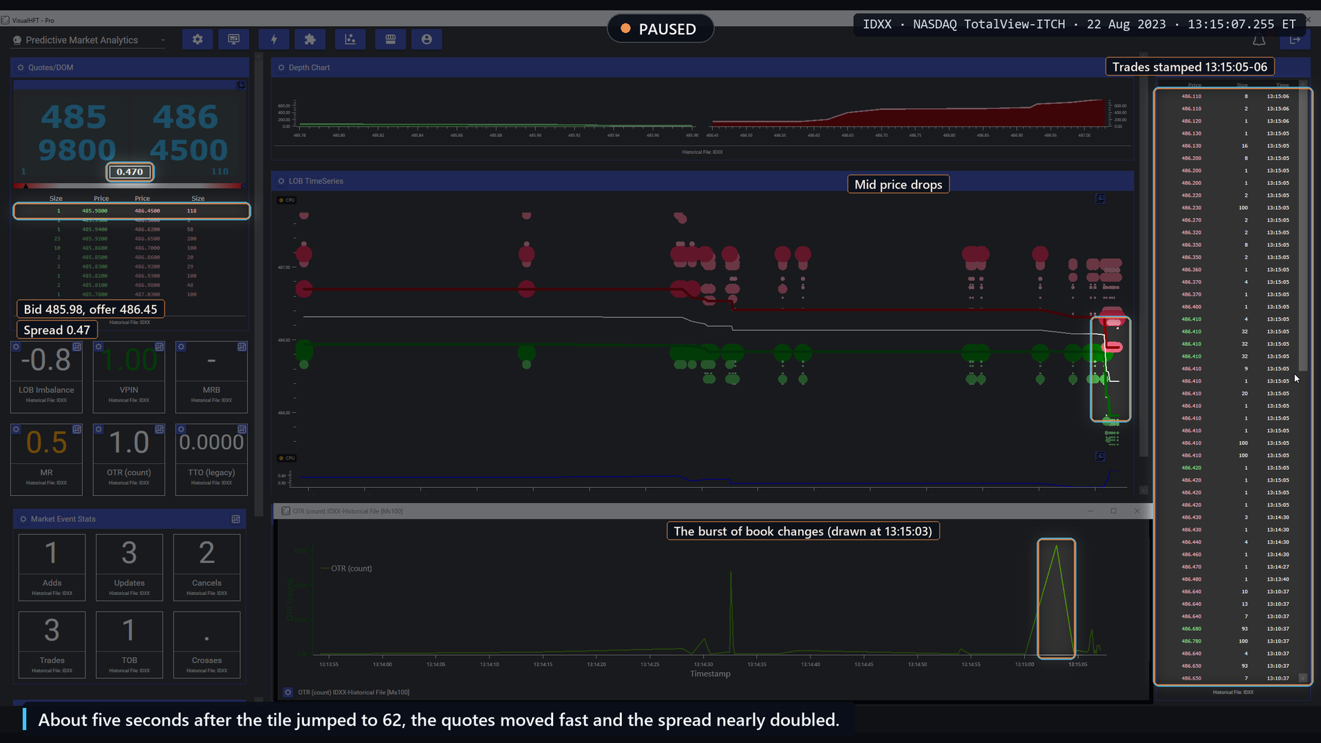
Pause 2, 13:15:07.3: the bid falls to 485.98 and the spread widens to 0.47.
What the day says
How often the capture’s picture happens. The rule: OTR reaches its own top 1% for the day and stays there for at least half a second. Within a second either side, the tape shows two prints or fewer while the state of the book changes at least four times. 40 of 61 such readings (65.6%) matched that churn-without-trades picture, against 33.1% at matched moments. Part of this is built into the ratio, since few trades is part of a high reading, so we treat it as a picture of the mechanism.
What happens in the next 10 seconds (exploratory). We then asked what follows a top-1% reading, against 50 random moments from the same symbol and the same half hour. This scan is exploratory: it was written after we had read the earlier results, no rule was locked in advance, and no free rival was tested against it.
| After an OTR spike, next 10 seconds | Hold-out (43 spikes) | Discovery (17 spikes) |
|---|---|---|
| Mid-price volatility above the symbol’s normal (median) | 69.8% vs 49.9%, p = 0.003 | 76.5% vs 47.4%, p = 0.010 |
| Quote flicker: best price changes that revert within a second, above normal | 62.8% vs 40.5%, p = 0.001 | 64.7% vs 35.5%, p = 0.008 |
| Spread widening by half or more | 51.2% vs 43.9%, not significant | 52.9% vs 38.8%, not significant |
Both findings held on both halves. They also held when the random moments were matched on how busy the book had been in the previous 10 seconds, though weaker: volatility 62.8% vs 49.9% (p = 0.049) and flicker 55.8% vs 38.7% (p = 0.011) on the hold-out.
The spread widening in the capture is real for that moment, but across the day it was not reliable. A larger move of three cents or more failed on the discovery symbols, so we make no claim about it.
As a forecast of fills or price impact. We tested whether a high reading means a resting order is less likely to fill, or that a trade will move the price more. A plain count of book updates did as well or better in every case we could test. At 100 ms, most windows contain no trade at all, so the tile mostly reads the number of book changes.
How a practitioner uses it
- Read it as a message-intensity gauge. A spike says the book is being rewritten fast while little trades. In the next seconds, the quotes you see are more likely to flicker and the mid more likely to move than usual.
- Do not lean on displayed size during a spike. The size on the screen is more likely to be fleeting in that moment. That is the Hasbrouck and Saar observation, visible in real time.
- Pair it with a trade-side view. OTR tells you about quoting. Time and Sales and TTO tell you about trading.
- Know what it is not. It is not the regulatory per-member ratio, and it does not identify who is quoting.
Limits of the metric
The count depends on the window length and on how many levels are tracked. At 100 ms most windows have no trade, so the reading is close to a count of book changes, and a simple update counter carries most of the same information.
Takeaway: an OTR spike marks a book being rewritten with almost no trading. In an exploratory scan of this day, the next 10 seconds were busier and more flickery than usual. That is context, not a direction.
6. TTO: trading overwhelms the book
The theory
Trade-to-order is the mirror of order-to-trade. The SEC’s MIDAS market structure program publishes the trade-to-order volume ratio for U.S. stocks and exchanges: traded volume divided by the volume of displayed orders, in percent. A ratio near 100% would mean almost every posted share traded. A low ratio means most posted volume was cancelled.
At high frequency, the ratio jumps when trading suddenly dominates book activity, as in an aggressive sweep that consumes displayed depth. That is close to the definition of the ratio itself: a sweep is a burst of traded volume, so a jump in TTO during a sweep is largely built in. The capture shows it happening; the interesting question is whether the reading tells you anything beyond that.
How VisualHFT computes it
In each 1-second window the tile divides traded volume by book volume, with a floor of one share:
TTO = traded volume / max(order volume, 1)On screen the tile is labelled TTO (legacy). Order volume sums the size added, updated and removed in the book during the window, so the denominator counts cancels and updates as well as new orders. That makes it a different statistic from the SEC ratio. The window resets every second, and the tile shows four decimals.
Watch it happen
AMZN, 13:09:30 to 13:09:40 ET. TTO at 1 second. Replayed near real time; one passage repeated at half speed. Watch TTO jump when trading surges against book activity.
Pause 1, 13:09:38. Look at the offer side of the ladder: 99 shares at 134.42, then 7,800 at 134.43. The TTO tile reads 0.0000. On the chart, the TTO line shows only small bumps over the previous minute. Now watch one second of trading.
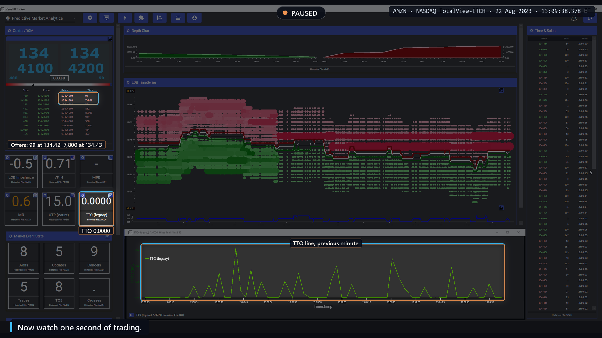
Pause 1, 13:09:38: 7,800 shares offered at 134.43; TTO reads 0.0000.
Pause 2, 13:09:39.5. Time and Sales shows 19 prints, 18 of them green, from 134.42 up to 134.44. Ten of the prints are at 134.43, where 7,800 shares were offered. One of them is 5,600 shares.
On the offer side of the book, 134.42 and 134.43 are gone. The best offer is now 134.44, the best bid 134.43. The TTO tile reads 0.2098 and stays above 0.2 for under a second. On the chart, the TTO line shoots up far above every earlier bump.
Buyers swept the offer. Traded volume jumped to about a fifth of book activity, and TTO spiked. The capture replays the sweep at half speed.
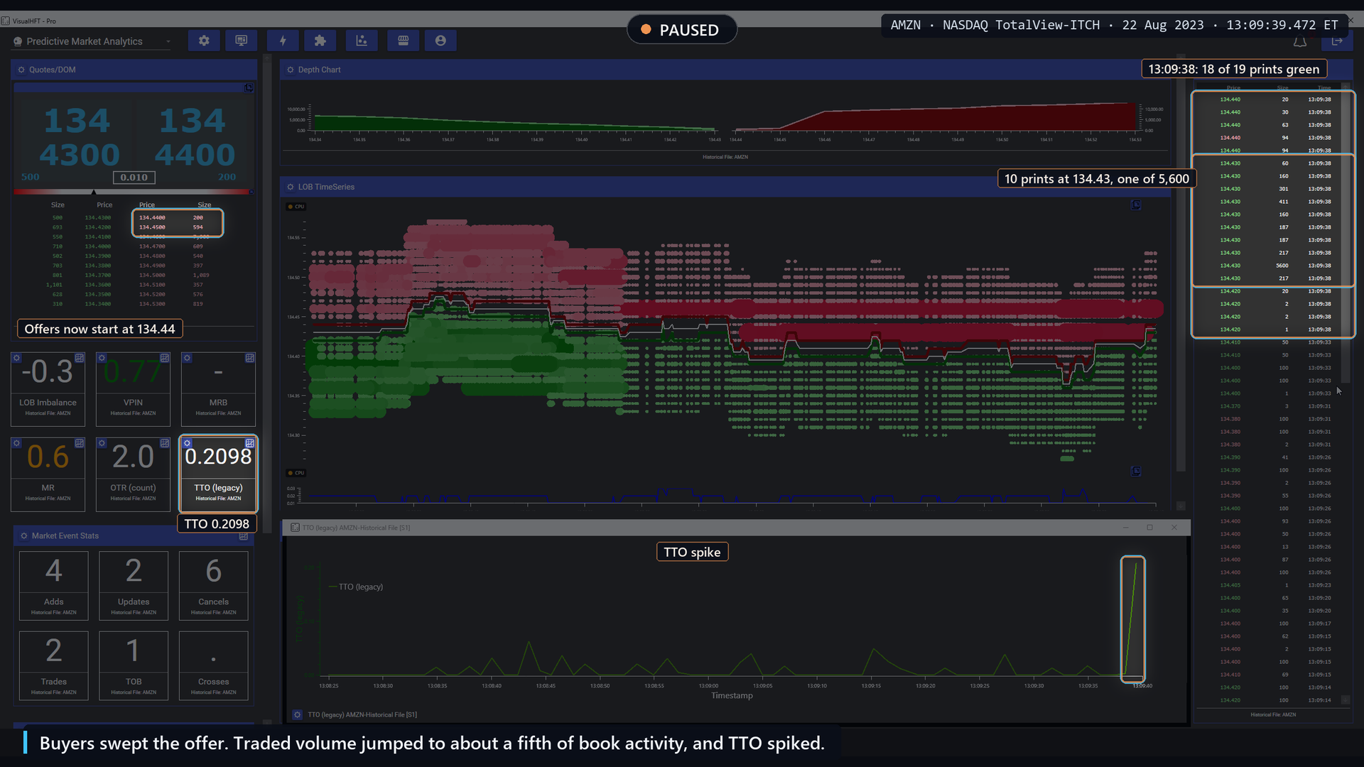
Pause 2, 13:09:39.5: the offer is swept, TTO reads 0.2098 and spikes on the chart.
What the day says
How often the capture’s picture happens. The rule: at least 5 prints on the same side within 250 ms that move the mid, then TTO reaching its own top 10% for the day and holding for at least half a second. 1,988 of 8,887 sweeps across the day (22.4%) showed that, against 2.7% at quiet moments. As noted above, this is close to the ratio’s definition.
As a forecast of fill quality. A common idea is that a passive fill taken while TTO is extreme costs more, because the flow is aggressive. Read naively, the data seemed to agree, but the fill penalty belonged to a simpler variable: where the print sat inside its sweep. Read causally, from the moment each value could have been seen, the sign reversed on the hold-out (p = 0.0005), and discovery did not confirm it.
How a practitioner uses it
- Use it to see sweeps at a glance. On a busy tape, the TTO chart makes the moments when trading overwhelmed the book easy to find.
- Scan the chart for sweeps. The chart keeps every spike, so a session’s sweeps are easy to find afterwards.
- Keep it off fixed scales. The ratio is unbounded. In a window with very little book activity it can jump far above 1.
- Pair it with OTR. Together they show whether the book is being quoted or being traded.
Limits of the metric
TTO rising during a sweep is close to a restatement of the sweep. It describes what just traded against the book. It does not describe what the next fill will cost.
Takeaway: TTO lights up when trading overwhelms the book. That makes sweeps easy to see. It does not add a forecast on top of the sweep itself.
7. From a tile to your own system: trigger rules and webhooks
Watching a tile builds intuition. Acting on a tile within the time a book changes means handing it to software. VisualHFT’s trigger engine connects any study metric to an HTTP call.
Step 1: a rule
Open Trigger Management from the lightning-bolt button in the toolbar and choose Add New Rule. On the Conditions tab, press + to add a row. Set Plugin to a configured study, Condition to an operator (Equals, GreaterThan, LessThan, CrossesAbove, CrossesBelow) and Value to the threshold.
CrossesAbove and CrossesBelow fire on the update where the value crosses the threshold. The others are true on every update that satisfies them, so pair them with the rate limit below.
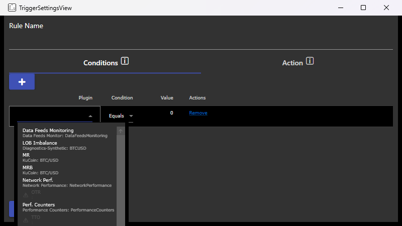
The metric picker in a new trigger rule.
Step 2: a webhook
On the Action tab, tick Webhook URL and choose Configure. The request is a POST to your URL, with optional headers, a JSON template, and a rate limit. Set the rate limit in seconds or longer so a condition that flips back and forth cannot flood your endpoint.
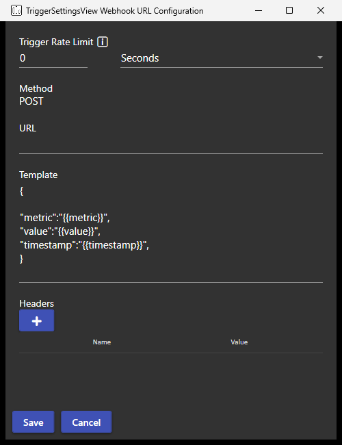
{
  "rule": "{{rulename}}",
  "metric": "{{metric}}",
  "condition": "{{condition}}",
  "threshold": "{{threshold}}",
  "value": "{{value}}",
  "timestamp": "{{timestamp}}"
}
What to wire, based on this study
- OTR spike as a context flag.
CrossesAboveyour symbol’s top-1% level, feeding a system that widens tolerances or pauses passive quoting for a few seconds while quotes flicker. - LOB Imbalance as a filter. A threshold on the tile, used to confirm or veto a price-based rule you already run, not as a standalone entry.
- Market Resilience for execution context.
CrossesBelowa low score, used to slow down child orders after a hit to the book.
If you wire a tile to your own system, test it the way we did: on your venue, at your aggregation level, against the cheapest rule you can think of, and with your own costs.
Takeaway: a trigger rule turns a tile into an event your own system can act on. The testing discipline stays yours.
8. Scorecard
| Tile (aggregation level) | What the capture shows | How often that day | Forecast test on the hold-out |
|---|---|---|---|
| LOB Imbalance, Touch Weighted (100 ms) | Book leans, holds, price moves its way | 52% vs 48.0% (p = 0.043); 62.4% of the 492 that moved | Next tick 73.9% vs 51.7% (held-out liquid symbols); ties the best free rule on hold-out, loses on discovery; moves smaller than the spread |
| LOB Imbalance, Equal Weight (100 ms) | No difference on the lean rule | Next tick 58.2% vs 52.8%; a free rule wins | |
| VPIN (1 s) | Rises while the tape turns one-sided | 35 rises; what followed: 45.7% vs 37.3%, p = 0.30 | Adds nothing to a volatility forecast |
| Market Resilience (500 ms) | Depth hit, score dips, depth refills | 79 of 845 depletions (9.3%) vs 3.0% | Does not track the next seconds’ cost |
| Market Resilience Bias (1 s) | Arrow points at the side that failed to refill | 127 arrows a day, median 30 s on screen | 52.1% vs 48.9% at 5 s; not a direction call |
| OTR (100 ms) | Book churns while nothing trades | 65.6% vs 33.1% of top-1% readings | A book-update count does as well on fills and price impact (exploratory next-10 s scan in Section 5) |
| TTO (1 s) | Jumps during an aggressive sweep | 22.4% of sweeps vs 2.7% | Sign reverses under a causal read; not replicated |
Every capture is a mechanism: a real instance of the tile doing what its theory describes, chosen from setups that met the rule, favouring clear moves. The table is the evidence.
9. What one day can and cannot tell you
- One day, one venue. Everything here comes from NASDAQ on 22 August 2023. A second session is needed before calling any of it more than a single-day result.
- The hold-out is other symbols, same day. It protects against fitting to the discovery symbols. It does not protect against a day that was unusual for everyone.
- Hit rates, not profits. No transaction costs were applied. Where we measured it, the correctly called moves were smaller than the spread.
- A 10-level book. Anything read off the book depends on capture depth.
- Captures chosen from setups that met the rule, favouring clear moves, not at random. Each section says how often the captured picture happens across the day. The MRB captures were chosen because the price followed, and their sections say so.
Takeaway: these tiles show you what the book and the tape are doing, grounded in published research. Whether any of them earns a place in a trading rule is a test you run on your own data.
Glossary
- Aggregation level. How often a tile publishes a value: 100 ms, 500 ms, 1 second. The chart plots the last value in each bucket.
- Aggressor. The side that crossed the spread to trade. A buy print lifted an offer; a sell print hit a bid.
- Base rate. How often an outcome happens anyway, with no tile involved. A tile has to beat it to add anything.
- Best bid and offer, the touch. The highest bid and the lowest offer in the book. The touch is the pair of queues at those prices.
- Bucket (VPIN). A slice of fixed traded volume. VPIN closes a bucket every time that many shares have traded.
- Causal read. Reading each value only from the moment it could have been seen, never from a time stamp that runs ahead of it.
- Depletion. A side of the book losing most of its near-touch depth in a short time.
- Discovery and hold-out. Discovery symbols are where rules and thresholds were chosen. Hold-out symbols are scored after each test’s rules are locked.
- Free rival. The cheapest rule that makes the same call without the tile, such as “the next tick undoes the last one”.
- Hidden order. An order that rests without being displayed. On NASDAQ some of its prints show at half-penny prices.
- Level. One price in the order book with the total size resting at it.
- Mid price. The average of the best bid and the best offer.
- p-value. Roughly, how often a difference this large would appear by chance if there were no real effect. Smaller is stronger.
- Resilience. How quickly the book returns to its normal shape after a trade takes liquidity out of it.
- Spread. Best offer minus best bid. The cost of crossing from one side to the other.
- Sweep. A burst of same-side trades that consumes one or more price levels.
- Toxic flow. Order flow that leaves liquidity providers on the losing side of the trade.
- TotalView-ITCH. NASDAQ’s full-depth data feed, which reports each order added, changed, cancelled and executed.
- Volume clock. Measuring time by traded volume instead of seconds, so busy periods advance the clock faster.
References
- Andersen, T. G., and Bondarenko, O. (2014). VPIN and the flash crash. Journal of Financial Markets, 17, 1 to 46.
- Cont, R., Kukanov, A., and Stoikov, S. (2014). The price impact of order book events. Journal of Financial Econometrics, 12(1), 47 to 88.
- Easley, D., López de Prado, M. M., and O’Hara, M. (2012). Flow toxicity and liquidity in a high-frequency world. The Review of Financial Studies, 25(5), 1457 to 1493.
- European Commission (2016). Commission Delegated Regulation (EU) 2017/566 of 18 May 2016, regulatory technical standards for the ratio of unexecuted orders to transactions. Official Journal of the European Union.
- Friederich, S., and Payne, R. (2015). Order-to-trade ratios and market liquidity. Journal of Banking and Finance, 50, 214 to 223.
- Gould, M. D., and Bonart, J. (2016). Queue imbalance as a one-tick-ahead price predictor in a limit order book. Market Microstructure and Liquidity, 2(2).
- Hasbrouck, J., and Saar, G. (2009). Technology and liquidity provision: The blurring of traditional definitions. Journal of Financial Markets, 12(2), 143 to 172.
- Kyle, A. S. (1985). Continuous auctions and insider trading. Econometrica, 53(6), 1315 to 1335.
- Large, J. (2007). Measuring the resiliency of an electronic limit order book. Journal of Financial Markets, 10(1), 1 to 25.
- Obizhaeva, A. A., and Wang, J. (2013). Optimal trading strategy and supply/demand dynamics. Journal of Financial Markets, 16(1), 1 to 32.
- U.S. Securities and Exchange Commission. MIDAS market structure metrics: trade to order volume ratios. sec.gov.
Related reading: